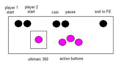
Along with the action buttons that will control jumping and shooting or whatever while I am playing I'm going to need "admin" buttons in order to make a game selection from the list, to insert a coin and to pause when I'm playing. I think 5 of these buttons will suffice (player 1 start, player 2 start, coin, pause and exit back to the game list). Here's my first stab at it:

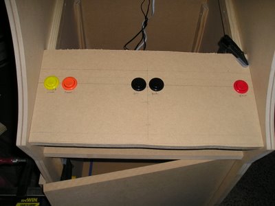
As you can see, I'm trying to keep the admin buttons all in a row on the top and then center the joystick and action buttons so it is comfortable while playing. I thought about this design for a few days and even made a mock-up (with different colored buttons) to see how it would look.

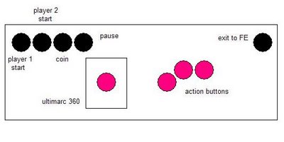
I didn't really like the spread out look of the admin buttons so I decided to redesign it a little bit. Here's what I came up with:

I clustered all of the admin buttons to the left except for the exit button - I don't want to accidentally hit this in the middle of a game when I'm reaching for the pause button to go grab a cold beer or something! I also rearranged the action buttons a little bit because I think it will be more comfirtable to play this way. Unless I think of anything radical in the next week or so I'm going to call this the final design.
Thanks for looking!!
No comments:
Post a Comment