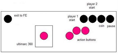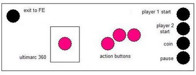
I like the new placement of the Exit button but I really don't like where the other 4 admin buttons ended up. The right side of the control panel looks too cluttered in this configuration. However, several people over at BYOAC answered my request for some criticism and suggested that I keep the Exit button on the left and the admin buttons on the right but line them up vertically. Genius!

I also moved the action buttons and joystick to the left a little so my right hand wouldn't be resting where the admin buttons are. I might have to make the control panel a bit taller but I think I have the room - as it stands now 6.5" might be tight for four buttons because I need to leave at least .75" on the bottom to accommodate the panel for the front of the control panel.
I really like the current state of the control panel and I'm going to make a mock-up out of MDF to test it out (so of course this is still subject to change!).
Thanks for looking!!
No comments:
Post a Comment